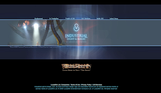
Remember that you only have but a few moments to make your impression on a website visitor, therefore, your message must be clear, not only will your website be easy to view and navigate, but from your standpoint, it will also be easier to design.
This is because the visual impression will be simple and focused, and will be judged primarily by the main image that happens to be on the homepage. You must decide what your homepage is going to say visually, and the purpose of your site.
For example, the students who have the task of making a website in my class, have chosen particular majors such as: animation, game design, visual effects, digital film and graphic design. Within animation and game design, the major can be broken down to another level, where students have to choose a focus, like modeling and texturing, responsible for conceptualizing and creating the assets to an animation or game, or they may be given the task of animation only. The website must immediately convey "the major".
In the ILM website example above, why did they choose that image? And who do you think they are trying to communicate with? Ask these same questions for your own site.
For graphic designers, I find that this is easy for them. They work from a visual medium and are well aware of composition and readability. They come up with lots of designs quickly, and therefore seem to have an easier time doing this. That's okay - go ahead and copy what they do.
Digital film, visual effects and graphic design students, must also narrow down their image to the "one" that best represents their work. One technique I see them do, is to take screen shots or still images of their movies. I found that this can be difficult at times because they usually have such a wide variety of work. A good solution for these students is if they have an aptitude for photography, a well designed photograph would suffice.
So decide, what you are and be familiar with the imagery used for the websites used in your industry. Do your best to emulate them and be sure you put your best work on your homepage.
That takes care of the visual part...
Now, ask yourself what you want this site to function as? If you are a wanting to design a creative website, you will want it to (these are the most common):
- show your best work (15 - 20 pieces is average) in a gallery.
- this includes a video demo reel.
- let people know about you (bio or blog).
- make it easy for people to contact you (contact).
This is a nice starting list for you, and if you haven't noticed it yet, it is also your beginning navigational elements. Start with these:
- Demo Reel
- Gallery
- Bio
- Contact
As a side note - I use my site to not only do the above mentioned items, but I also use it to connect to my webmail, facebook, animation highlights, and to many other websites I visit a lot. I wanted to make my site in such a way that it also makes my daily work easy.
So there you have it, let's recap:
- Before you begin, decide your message and simplify it as best you can.
- Decide on an image that best represents you and your work (this will be your main image other known as the "money shot")
- Decide on your functionality (I've recommended a few)
- What are the main links on your homepage,
- Is there anything else that you would like to add to your site that would help you become more efficient.
Have a great time designing. Now its time for the fun part.
- - - - - - - - - - -
If you found this helpful, you may want to read the following related posts.
A Quick Homepage Design Technique.A Note on Design The Money Shot: Establishing a Main Image **
Visual Heirarchy **
** Coming Soon
 Before we begin, we have to talk about a few things. Mainly, some of the most important concepts in graphic design that you will use to enhance your site.


 Posts
Posts

