Sunday, December 27, 2009

Using Twitter & Facebook to Generate Site Traffic

So how does Twitter and Facebook play into this? If you are anything like me, you were probably skeptical. Here comes another technology fad thing.

I also didn't like the name..."Twitter"?, it sounds too cute, kinda girly I thought. Then, I see Oprah, Ellen and Ashton Kutcher using it...okay, definitely not for me. If you're a guy, maybe you can relate. Who needs this stuff?!

But... you can't deny its popularity. Its in the news every day, and so I decided to give it a try especially at the request of some of my students...and ha ha... I like it now, and here are the reasons why, beginning with the ability to increase site traffic...

1) Remember....Once you decide to put ads on your site, you understand that revenue from these ads is based on the amount of clicks your ads receive, which is directly related to the amount of traffic your site gets. If more people visit your site, then the likelihood of someone clicking increases too.

This is a great thing because from a creative standpoint, it encourages you to constantly update your site/blog, and it also encourages you to maintain high standards for your content. For example, if you are a creative, you will post good animations, well crafted drawings, thoughtful designs, sketches and blogposts.

So here's how you do it, but remember that everybody uses it differently. When you post new content on your site or blog. Simply send out a Twitter feed to let everyone know about it and that's it. If you are consistent in frequency and quality, people will come and visit. I have a group of people who follow my tweets and once in a while, I get new followers who watch for the type of content I post, they get notified (somehow) and they end up following. This is great.

The best thing, is that some followers have thousands of followers themselves, if these "whales" like your content, they'll link to you. This is how more and more people visit you and its quite a remarkable way to spread news.

Facebook works in the same way, and if you've been on it for quite a while, you've established a nice friend list comprised of many hundred individuals. Unlike Twitter, these are close colleagues and friends, who would check out the post out of pure interest and because it helps them out. They trust you and therefore are more likely to visit your post.

2) Since joining Twitter, I can't say enough about the inspiration I've received by following certain people, my blogposts have doubled in frequency since joining Twitter. The following tweets are my favorite and since I started following them, I never run out of topics to blog about. By following them, I'm constantly inspired professionally and personally. I used to follow lots of people, but after a while, you begin to filter the "junk". When you get a chance check these people out - its a great way to stay informed - here are my top 3:


Wednesday, December 16, 2009

Ads: Making Money on Your Creative Website

Sounds interesting and tempting doesn't it? This post will cover how to use ads on your website. It will show you where to go, appropriate places to put them, and other benefits of placing ads on your site.

Let's not forget however, that your creative website, by nature, is created to make money already, your creative website shows off YOU and Your skills: your awesome sense of design, use of color, drawing and painting ability, and if you are an animation or game design major, your animations, level and concept designs. An employer will look at all of this, make an impression of you and will hire you if you fit the job…If you follow the advice I give you on this blog, the impression an employer has of you will be positive you'll get that job you want, or at least, a chance for a second interview. If many people wanting your skill visit your site, and feel that you can help them, then your website is making you money…you are building a clientele and your site is helping you. This is the primary way that your website will make money for you.

The second and third way, is based on ads placed on strategic areas on your site. I will tell you where I place these ads on my site, and the areas where I feel its a “No No”. There are many online ad programs you can use, but I use Google Asense because it seems to be the most common, Google is huge and dependable (so far) and I like the data you get when you use them, I'll explain that as well, but keep in mind too that there are many nonmonetary reasons to put ads on your site too.

For example, the ads you place on your site will be able to track the traffic your site gets. Through the Google Adsense, you will be able to see how many page impressions you have for the day, yesterday, the week, the month, the year, and you will also be able to see what the most popular pages are on your site, that's cool.

The best part I like the most, and its totally personal, is that since I have ads on my site, and I get paid for each click or page impression, I have to do my best to generate traffic. This means I have to continue to generate meaningful content, that people want to check out. This puts me in a state of constant creativity, I’m always posting cool stuff on my blog, and I’m constantly creating things like small animations, new paintings, tutorials and sketches and letting people know about it.

Let’s talk about where to place your ads, but let’s start with the bad news first….let’s start with the Don’ts.

Don’t place ads on your gallery or demo reel page…the pages that show off your work. This is totally tacky. Imagine slapping stickers on to a portfolio…that’s what you are doing when you put ads on the artful/design areas of your site. Stickers are good if you are a NASCAR driver, but you are not, you haven’t even started your career, so don’t do it. Also, don’t place ads on your contact page or bio page.

On the flip side, DO place ads on the commercial portions of your site, and the primary place I place ads is on my blog, and one, well designed, strategically placed ad on my homepage. I started putting ads on my homepage because I wanted to see how many people were visiting my site, at the time, it was getting roughly about 200 page impressions a day, doesn’t sound like much, but in about a week that’s over 1000, and almost 4000 page impressions a month. I figured, since Google Adsense, compensates for the amount of page impressions, I might as well give it a try. I was hesitant at first, but once the ad was up, I liked seeing the data arrive about my main homepage.

The part I was worried about the most, was that I just didn’t want to have a gawky ugly ad on my site that didn’t belong, so I designed it to be part of my homepage where it wouldn’t draw too much attention. The ads were terrible looking at first, but after about a month, the Google Ads figured out the best ads to place on my homepage, and started putting ads that are relevant to the content of the page. It was nice to start seeing ads for the Hellboy II DVD, anime, aniboom, Star Wars Toys and WACOM tablet ads (which are beautiful ads by the way), once in a while though, ugly ads show up, but that’s okay, ugly or not, the site still looks good.

Surprising to me however, was the activity my blog, “The Caged Tiger’s Templar” was receiving. This is a blog that I would keep for myself regardless of whether or not I have ads on it or not. I use it to log cool things I see on the internet that inspire me, like game and movie trailers, animation and visual effects examples, demo reels and tutorials, and after I post them, share these with my class. This is invaluable and I love it. The entire blog continues to grow with content that I like and am happy that other people other than my students are checking it out.

Since I update my blog all the time, Google will sense that the information is current and new, so it places it high on certain search queries. This is not always the case, but once in a while it does, and again it helps drive traffic to my site. After putting ads on my blog, I also realized that the page impressions on my blog, rivaled the page impressions to my homepage.

And the last thing, is Google Analytics, similar to Google Adsense, it gives you more information about the traffic of your site, like bounce rate, and what keywords people are typing in a search to find you. That’s amazing interesting information you should know about your site, its free and it’s a skill that makes you an invaluable asset to a company.

So there you have it, the reasons why you should place ads on your site, and the correct places to put them.

To begin, start by signing up for Google Adsense and follow the directions for placing ads on your site and blog. If you have a Blogspot account, navigate to your dashboard > page layout > and look for the Widgent called "Adsense". There, you will paste the code given to you after signing up with Google Adsense and you will be well under way.

So, personal question....You are probably wondering how much money I made doing this? To be honest, I wish I made more…as much as these guys who make thousands of dollars per week (Steve Pavlina), very inspiring, but for me, here’s a realistic number. When you reach your first 100 dollars, Google will cut you a check. It took about 2 years to reach that and am approaching a second check soon. I figure, the more I drive traffic to my site by producing great stuff, and by posting on my site, the things I like the most, it can’t go wrong. It can only grow.

I’m always on the lookout for ways to broaden my blog activity, not just to animation students and animators, this is a small niche, but to broaden my market and reach more people, I was prompted to design a blog, “3 Seconds to Impress” to help people like yourselves make effective sites. I wrote about placing ads on your site because many students have requested it. Hopefully this helps you out.

Just remember, that your site generates money all by itself, if you do this, without doing much and it grows on its own as long I add to it to make it grow. The next step for you, is to use Twitter and Facebook to drive traffic to your site.


Monday, November 30, 2009

Embedding Video Code on to an HTML Page


This video tutorial covers how to embed video code on to an HTML page. It requires that you have some knowledge of Photoshop, Dreaweaver and HTML. If you don't, no worries, I cover it in the video.

These days, in order to save space and money, people elect to upload their videos / demo reels on to a site like Youtube or Vimeo, which is a process I highly recommend. Placing video embed code on to a blog or webpage is quite easy, its a simple copy and paste procedure, but sometimes, people want to have pictures or a design around it. This video tutorial shows you a quick way to do so.

Doing so enables you to:
  • Watch the clip full screen.
  • Saves server and hard drive space.
  • Can be viewed from any computer.
  • The sound quality is nice.

Tuesday, November 24, 2009

Gallery Design: Video Tutorial


This is a video tutorial about how to create a Level 2 Gallery Page. The tutorial covers design, layer masks, and alignment in Photoshop, this is a way easy. A second tutorial programming this page will be created soon but be sure you review the previous tutorials about how to design a homepage and level 2 page, the links are below. If you have any questions, please let me know.

>> Designing a Homepage
>> Designing a Level 2 page.

FYI - Video tutorials can be monotonous at times, so in this tutorial, I didn't talk, and just left the internet radio on. Hopefully you can follow along.

Fire It Up!

Randolf

Wednesday, November 18, 2009

Level 2 Webpage Design Tutorial


When designing second level pages for your site, its important that you maintain continuity and harmony, otherwise, people will get confused and leave. These pages are also the entry way to the main content of your site. This video tutorial shows you a process for designing level 2 pages for your website that look similar in design to a your existing homepage.

Be sure you watch the previous tutorial "Quick Homepage Design Technique" on how to design a homepage first before viewing this tutorial.

Designing the "Gallery Page" is the most difficult of all Level 2 page designs because of its complexity. This will be covered in a later tutorial.

This tutorial covers the following topics: design grid, typography, placement and color.

- - - - - - - -

Be sure you check out the previous tutorial:

A Quick Homepage Design Technique

Friday, November 13, 2009

Graphic Design Crashcourse: Introduction / Overview

Before we begin, we have to talk about a few things. Mainly, some of the most important concepts in graphic design that you will use to enhance your site.

This will be the first part of many that will cover some of the basic concepts of graphic design needed to create an effective homepage design. Once you are familiar with these terms and concepts, you can use them to improve your design. The series will be broken down by topic, I'll describe each, provide my own insight into each and will provide you with examples to look at and compare.

NOTE: Just know that there is no substitute for getting formal training on design with an experienced instructor and experiencing a classroom critique of other designers. An experience like that makes you stronger and more critical as a designer. If you like this stuff and are serious about it, you should go to school to learn it. Its lots of fun. The items I highlight are simply the most common in my classes that have the greatest affect on creating a website.


Part 1: Purpose - What are you trying to say? Simplify Your Message >>

Part 2: Visual Heirarchy - Direct the viewer's eye, so things are clear.
  • Dominant
  • Subdominant
  • Subordinate

Part 3: Form - Make the viewer feel comfortable.
  • The Grid
  • Golden Rectangle
  • Rule of Thirds

Part 4: Harmony - Use color to convey an emotion and to keep everything together.
  • Repitition
  • Colors - Kuler
  • Eye Dropper Tool
  • Fonts I

Part 5: Contrast - Create visual vibrations in your design with these simple techniques.
  • Size and Scale
  • Color
  • Texture

Part 6: Usability - Let's make buttons.
  • Fonts II
- - - - - - - - - - -

If you found this helpful, be sure to check out:

Part I - Simplify Your Message >>

Graphic Design Crashcourse - Part 1: Simplify Your Message

Remember that you only have but a few moments to make your impression on a website visitor, therefore, your message must be clear, not only will your website be easy to view and navigate, but from your standpoint, it will also be easier to design.

This is because the visual impression will be simple and focused, and will be judged primarily by the main image that happens to be on the homepage. You must decide what your homepage is going to say visually, and the purpose of your site.

For example, the students who have the task of making a website in my class, have chosen particular majors such as: animation, game design, visual effects, digital film and graphic design. Within animation and game design, the major can be broken down to another level, where students have to choose a focus, like modeling and texturing, responsible for conceptualizing and creating the assets to an animation or game, or they may be given the task of animation only. The website must immediately convey "the major".

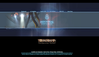
In the ILM website example above, why did they choose that image? And who do you think they are trying to communicate with? Ask these same questions for your own site.

For graphic designers, I find that this is easy for them. They work from a visual medium and are well aware of composition and readability. They come up with lots of designs quickly, and therefore seem to have an easier time doing this. That's okay - go ahead and copy what they do.

Digital film, visual effects and graphic design students, must also narrow down their image to the "one" that best represents their work. One technique I see them do, is to take screen shots or still images of their movies. I found that this can be difficult at times because they usually have such a wide variety of work. A good solution for these students is if they have an aptitude for photography, a well designed photograph would suffice.

So decide, what you are and be familiar with the imagery used for the websites used in your industry. Do your best to emulate them and be sure you put your best work on your homepage.

That takes care of the visual part...

Now, ask yourself what you want this site to function as? If you are a wanting to design a creative website, you will want it to (these are the most common):
  • show your best work (15 - 20 pieces is average) in a gallery.
  • this includes a video demo reel.
  • let people know about you (bio or blog).
  • make it easy for people to contact you (contact).
This is a nice starting list for you, and if you haven't noticed it yet, it is also your beginning navigational elements. Start with these:

  • Demo Reel
  • Gallery
  • Bio
  • Contact

As a side note - I use my site to not only do the above mentioned items, but I also use it to connect to my webmail, facebook, animation highlights, and to many other websites I visit a lot. I wanted to make my site in such a way that it also makes my daily work easy.

So there you have it, let's recap:

  1. Before you begin, decide your message and simplify it as best you can.
  2. Decide on an image that best represents you and your work (this will be your main image other known as the "money shot")
  3. Decide on your functionality (I've recommended a few)
  4. What are the main links on your homepage,
  5. Is there anything else that you would like to add to your site that would help you become more efficient.
Have a great time designing. Now its time for the fun part.

- - - - - - - - - - -

If you found this helpful, you may want to read the following related posts.

A Quick Homepage Design Technique.
A Note on Design
The Money Shot: Establishing a Main Image **
Visual Heirarchy **

** Coming Soon

Thursday, November 5, 2009

A Note on Graphic Design

Before we get too far with all the cool tips and tricks you are going to learn from this blog, it may the best time to talk about graphic design. Graphic design is the base for all that we are going to do here. I feel the need to write about it because for me, its a love hate relationship. I studied it in college and have an aptitude for it. I can arrange elements on "whatever" and I can make it look good, and I got better as I soaked up more experience. I like to design for large companies, but I LOVE to design for myself, like my own website, and even better, I LOVE teaching design and watching people get good results from what I share with them.

In college, I studied the craft of illustration. The people in this major were like me, we liked to draw, paint and animate, and from a distance, we made fun of the "graphic designers". "Ahhhh, they can't draw", we would say. They always wore nice clothes, were always in front of the computer and designed business cards that had small letters on it that we could barely even see. This wasn't me, and in college, you are naturally going to gravitate to like minded people such as yourself. I was an illustrator.

That was many many years ago, and since then, here's what I know (graphic designers, you are about to be honored here)...

All businesses, in order to make money, survive and flourish, have to sell. It doesn't matter what they sell, it could be the greatest thing ever invented...but here is the key, and I want you to remember this....

"If nobody knows about it, or how its going to help them...nobody is going to buy it".

In other words..."marketing".

Companies spend millions of dollars to staff their marketing departments. They have the responsibility making sure that everyone knows what Company A sells and how their product is going to help people. A good example of this are the Paul Rand logos at the bottom of this post. Do any of those logos look familiar? How many of these companies still use that same logo?

Marketing and branding is a simple but powerful idea that affects you in every way, every day. Companies know it and will continue to send out company messages to you...think about the following:

  • Have a Coke and a _______.
  • What is Target's logo?
  • What was the last pair of sneakers you bought? Why?
  • What colors represent Coke? Pepsi? Mountain Dew?
  • What colors does Tiger Woods wear when he plays golf?
  • Superbowl commercials.
  • What color is the Yahoo logo?
  • Why do people like driving Prius, Mercedes and Toyota.
  • What car do you drive today?
  • The most popular toy this holiday season is?
  • Why do you go to Starbucks (for the coffee drinkers)? What color is the Starbuck's logo and what color are their uniforms?

The list goes on and on, and each is a marketing decision, that contains a well crafted strategically delivered message that somehow crosses your senses: tv, radio, computer, cel phones, billboards, signs, and we even wear the messaging on our bodies - does anybody know why that Ed Hardy brand is so popular? Or why do ladies spend 400 dollars on a Coach purse (holy smokes! - I know those Coach people love this.) Its all around us, but companies need to be in front of our faces so that we are reminded of their existence, products and or services, and they plant reasons for us to buy.

As I'm writing this, I'm typing on a Mac Powerbook, using a Logitech Cordless Mouse and in a few minutes will take a break to play on my daughter's Nintendo DSi.

So where does graphic design come into play? They are the ones responsible for how everything looks and feels and how that message is delivered to you. They make sure it looks nice, appealing, and that the messaging is clear for the target audience. They are closely related to the company's ability to make loads of money and if things don't look nice, or aren't clear, a company is not going to have good results and will eventually tank.

By the way, graphic designers become art directors and therefore are responsible for hiring illustrators and animators like me. Like I said, they control the money. So I treat them pretty nice.

How does this relate to you? Remember that you are about to build your website... these days, one of the single most important marketing tools that you have as an independent creative individual. Whether you like it or not, you (and your name) are your own brand. You are the CEO of your own company, and this company is YOU.

Therefore, you have to market yourself professionally. You have to look good and your branding and messaging must be clear. This is evident and felt in the way you choose to present yourself through your website, and it includes the coordination of the following:
  • your use of color
  • your main image choice
  • your layout
  • font choice
  • word usage
  • usability
  • flow
Which is why I decided to put together this blog. Unlike our graphic design counterparts, animation, digital film, visual effects and game art majors don't study marketing design as a graphic designer would, so it is my intent to post many of these main points that graphic designers are familiar with so that you too can have an effective, aesthetically pleasing website that you are proud of and that will help generate money or opportunities. If you follow the tips and tricks I share in this blog, you could potentially have a site that looks as if a professional graphic designer created it.

So there it is, be nice to graphic designers. Their job is important. Their talents help drive marketing, which then helps drive the economy. Be kind to them and do good work while you are in their presence because they might be able to use your talents and skills one day.

Graphic designers of the world, we grovel at your feet.

A Quick Homepage Design Technique


This tutorial, shows you how to create custom homepages from existing ones. For this to work, you need to flag and take screen snapshots of well designed sites. I usually stick with the large companies homepages because of their design and simplicity. In the examples here, I'll be using the Jaguar site and the Mini Cooper site.

I usually show this technique to people who aren't trained graphic designers and I find the results to be pretty cool. At first, it seems like copying, but once you replace the main imagery, logo and navigation with your own, it will look totally new. You are only borrowing the template and the general flow for where items are placed.

Quantity is the key to this exercise, the more designs you do, the options you'll have, which will eventually lead to a better decision as you narrow things down to your final design. I recommend designing 3 - 5 mockups to get you started.

I also like this technique because it requires little or no coding. Everything is visual and I find that people have lots of fun doing it.

Be sure you check out my next video about adding functionality and programming to this homepage.

This will be my first customized video for this blog, it turned out better than I had expected. Looking forward to making my next one soon. The backround music for this video tutorial was provided by my friend DJ Ilo.

Let's Begin!

Friday, October 30, 2009

3 Seconds to Impress

For the last three years, I've taught a web design class where I help animation, game design, visual effects, and digital film students set up a website where in they can market their work. The class is essential and is now a requirement to graduate. The class is lots of fun to teach, its always different, there's always something new when it comes to the internet, and the product they make, which is personal, can help them generate opportunities for work or income.

These days instead of recruiters requesting to view demo reels (a video presentation of your best work) on CD's and DVD's, recruiters and art directors are requesting to see URL's and or websites. Its just the way things have been going, and now with mobile devices such as iPhones and Androids, they can look at your work from any where - even in the bathroom, now that's efficiency.

If you are reading this, you are probably interested in putting together your creative design website, and you probably have a few good reasons to have a site, this is awesome, but here are mine, perhaps some of our reasons match, and maybe some are new. There are many benefits/reasons to having a website of your own as an artist, animator or designer, here are the top reasons - the main one being last:

  1. An art director can see your work through a gallery.
  2. You could put more pieces in it (15-25) - Unlike a conventional portfolio that only holds what one could put in a case.
  3. You can show a greater variety of pieces like concept sketches, color roughs and sketchbook pages...pieces that you wouldn't put in conventional portfolio, but in a web portfolio, its perfectly fine.
  4. Sometimes art directors like to see how you arrived to a solution, showing a sketchbook is a direct way to show this.
  5. You can show animation or video clips that you’ve created, which show your editing, timing, use of sound and presentation.
  6. An art director or recruiter can learn about your interests if you keep a blog.
  7. Its shows that you understand technology.
  8. That you know how to present and market your work.
  9. They can contact you easily through a "contact" page link.
  10. A visitor to your site can see and interact with your work and contact from any computer any where in the world (this is cool, especially when people are contacting your from another country - it can be fun and eye opening).
  11. And the last (and this can either be good or bad depending on how well you do), is that a visitor to your site can make a quick impression of you in about three seconds (thus the name of this blog).
In my experience in working with other web designers and usability experts, there is consensus that most of us on the internet, don't like to read. If you think about it, its true. Yes, we read here and there, and will read information that we are hunting for, but for the most part, humans are visual and tactile beings, which means that we like to see and do things, its how we learn, improve and get better, that's just how we are. This is a great thing if you understand and believe it, and here, we'll use it to our advantage in designing our website.

Imagine looking at a large web page with nothing but text, no colors, no thought to the design...boring right? People react more to images first before reading text and their eyes are scanning the page looking for something to click and or type.

So, when we visit your creative design website, in the first three seconds, we are going to make an impression of you and your work. We are not going to verbalize it but everything from what I know is done through feeling. Let me walk you through what happens in those three seconds, and as you read this, see if you can relate to it by visiting your next website. Pay attention to your first impressions and feeling upon entering a site. You already have assumptions about the site just from what you see from the homepage (more on this later).

Here's an example, when I visit your site, I am first going to be affected by your main image, which is the largest image on the homepage. This image and the term I use for this image is called "The Money Shot". I know, I know, its a porn term too, you are going to have to research that on your own - "no money shots" of the other kind here, but I really don't want to call this anything else, because you really could relate this first image impression to money, let me explain. This main image is crucial because it sets the tone for your website. It should be your best work. It’s the first piece we see, and its also the last one we remember upon leaving your site...this is key.

Also, in those three seconds, I have an idea of your sense and level of design. I can sense this by how you choose to display your main image, the colors you use around it, if it is clear and navigable, the typeface that you choose (there are some no no's here - a blogpost on this soon), and usability - can I get to things easily once I enter?

In about three seconds, I (the visitor to your site) will choose to either explore your work and learn more about you, or leave. These days, recruiters and art directors are so busy, that they are appreciative of the fact that you put the time into your design to make it clear, quick and easy to use.

When visitors to your site leave, you lose:
  • Potential opportunities for work.
  • Money
  • Return visits.
  • Your reputation might get damaged too.
On the topic of "3 Seconds", do you ever notice those "loading" graphics when you enter a website. For those non-web designers, that's called a preloader, and it’s a graphic that lets you know that something (usually a Flash graphic - Flash is an application used to create animations and presentations on the web) is loading up before it plays. Usually this is also accompanied by a "Skip Intro" button right. And I'm sure lots of people have worked hard on their intros, but can you tell me about how long people will wait for that "Loading" screen?

I ask my students all the time, and they almost always skip it. Me included. I'm telling you, people browse and scan the internet, and our impatience makes us move on to the next thing, its easy to do with a click of a mouse and we can't wait. This is one of the main reasons why I choose not to design in Flash as much.

In teaching this web-design class for non-web designers, I found it to be easy and fast to show someone how to put up a site without the use of Flash (a steep learning curve), but instead to just use Photoshop and basic Dreamweaver tools. It’s way easier, faster, easier to organize and keep track of, and it’s not unusual to have Flash designers switch. For these guys, I usually recommend for them to establish a design in Photoshop first, make sure the usability is nice, tight and clear, and then translate it to a Flash design.

Another option is to have a bumper page at the beginning of your site, where you give visitors to your site the option to either choose the HTML or Flash version of your site.

So, now you know why this blog exists. "3 Seconds" is all you have to make an impression, and on the internet, it is so true. Every design recommendation I offer you will always be from this "3 Second" standpoint, and therefore your choice to implement it or not, is a business decision. When it comes to your website, you are the captain of your own ship, the general of your own arm, and the CEO of "Place your name here" Incorporated.

Do your best, keep your eyes open to cool designs, and have fun. I wish you the be – of luck, thanks for reading and if this blog has helped you, let me know. I really would like to hear from you.

Until the next post...happy designing.

Tuesday, October 27, 2009

Placing Video Embed Code


The Assassin's Creed Trailer came out this week, and unlike the game, this trailer features live action footage. The interpretation is incredible. I think is so cool. They really should make a full movie. I would pay to see this.

In this example, we copied the embed code associated with a Youtube video and pasted it on to a blog post. The process is quite easy and I also recommend that as you post a video or picture, that you also write a small sentence or two about lending your opinion about the piece. Having both and image and text work together to make an engaging presentation.

Here are some images to help you with the process...

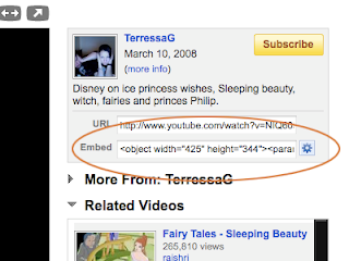
Copy the embed code from Youtube here:


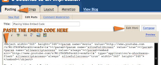
Then, under Posting > Edit HTML Tab > paste the copied Youtube code. As seen below:

The Creative Blog: An Enhancement to any Website

I've had my website since 1999, and if I could do it all over again, I would simply make a blog, because it is easy to put together, you can update it from anywhere, you can post everything a website can do, like words, pictures, video and people can contact you through it. I'm pretty sure I could make it work as my main website, as I've seen many people do it. But that's not what happened...I have a regular website that I've designed in Photoshop and Dreamweaver but keep a Creative Blog as an enhancement to my site.

For those of you who have never designed before, and if you are wanting quick web presence, then a blog would be a smart decision for the reasons I mentioned. I've recommended this option for many instructors and they like the option. Designers, animators or game designers, will want a main website to showcase their work, and we'll get to that later, but before we do, a good move for you is to create a "creative blog" that will be an enhancement to your future site.

A blog can be about anything and I have many (yes, I went overboard and was hooked on the idea for a while - but I've calmed down a lot), I've used them to keep notes on images and videos I see on the internet to help me with research, another keeps track of my football scores, I post animation curriculum and my favorite...I use one as a source of creative inspiration for me and my students.

This is the blog that I maintain on a weekly basis and I love it, there are lots of funs things on it that inspire me and that I like to show my students:

http://randolfs.blogspot.com/

YOU will use your creative blog in this way...when you see something cool on the internet (which is pretty often), if it inspires you to make great work, if its funny, if it energizes you, if you think its a good example of great design or animation, maybe its an artist you admire, maybe its a cool website, you will post it on this blog. When you post it, it will be available to you for as long as you have the blog, and you will find great enjoyment watching it grow as you add posts and layers of inspiration to it. It is a great feeling and it gets better when you find that somebody out there finds what you are posting helpful and inspirational too. Its awesome, its simple, it spreads love and you can do it.

Some other benefits to creating a "Creative Blog":
  • It shows that you are in tune with your industry.
  • That you keep current.
  • It shows initiative on your part for learning a new technology.
  • Many professionals in your industry keep blogs.
  • These same professionals check one another's blogs.
  • It shows your interests (me, I like robots and awesome demo reels).
  • You can showcase works in progress, like sketchbook work.
  • Or current pieces that you like, but won't necessarily place in an online gallery.
  • Its dynamic, constantly changing and growing, where as your main website might not change as much.
  • Posts are automatically archived so you can look at the later (sometimes years later).
  • It can be easily organized with the use of labels.
  • Oh yeah, and did I mention that its FREE?
There are many blog formats out there, but the one I am most familiar with and the one I pitch most often is Blogger. I do so because of:
  • An easy interface (super easy to use)
  • From a design standpoint, the templates are nice and clean (this is huge).
  • Its owned by Google (Its still the number one search engine, and is not going anywhere).
  • You can customize the colors to make it feel like it is part of your main website.
  • You can place ads on it (we'll talk about this later - I heard Wordpress doesn't allow ads).
So go ahead, let's start by establishing webpresence by creating a blog for you. Start first by signing up for a google account. Or logon to the official blogger website, I think they are same thing.

Once you logon, establish a name for your blog, as well as a URL name. For example, my blog is called randolfs.blogspot.com, but my blog title is, "The Caged Tiger's Templar". Its nice if your blog title is somewhat creative. I usually play with word combinations to help me brainstorm great titles, so pull up Thesaurus.com to help you generate more options or keep a friend's email or phone number handy so you can run ideas by them. Don't worry if you don't find a cool name or URL, you can always change it later.

The next lesson, will be about how to customize your blog, and some of the best practices I put into place about posting images, text and videos on a blog. Save the webaddress to your blog, and we'll connect it to your homepage (this will be another lecture).

Good luck and have fun putting together your creative blog, if you have any questions, send them my way.

Do your best and have fun.

Introduction

I'm an animation instructor and I enjoy what I do, but before animating however, my background was in graphic design and illustration. I've been a lead corporate webdesigner for a Fortune 500 company for many years, I've had the pleasure of working with IBM Usability Groups in designing various sites, and I've freelanced for a variety of companies of various sizes.

In my journeys, I've worked with many talented marketing and design groups to help companies establish web presence, nowadays we all know that it is a crucial marketing tool, and most importantly, as a designer, I've experienced the joys and pitfalls of effective design pertaining to a website. I learned how large corporations use their sites to market themselves and how they make money.

Design and marketing go hand in hand, but for many of us wanting to establish web presence, design is not an expertise and it makes a huge difference. Welcome aboard! This blog will address some of the essentials of putting together your own creative website. It will cover the elements of putting together a great first impression for a visitor to your site within the first 3 seconds, this includes, design, color, usability, maintaining your site, blogs, using the site as marketing tool to showcase your work, posting demo reels, and later on, the use of ads and twitter to generate revenue from your site.

At the college I teach at, many instructors and students who are non design majors want to put together a website. The instructors want to use it to showcase their work, keep in contact with students and to make themselves more marketable. Let's face it, education is using the online medium more and more and so the marketable teachers are the ones who have some kind of online teaching experience. Many classes are solely taught online. We teach and encourage our students to put together a website so they can market their work, shouldn't the teacher know how to do this as well? If you are a teacher who is need of some kind of webpresence, never fear, this blog will help you out.

For my students, many of them have studied animation and game design for many years. They really haven't studied design in a way that a graphic design student has. So I show them the essentials and help them make kickbutt websites that will help them land jobs that they want.

I hope you will find this information helpful. Be sure to subscribe so you are updated of new posts so let's get started. My first post will be about putting together...

Creative Blogs

Wednesday, October 21, 2009

Changing Gears


This blog, had served its purpose in helping me to achieve my MFA in Computer Animation. It has been over a year since my completion of the program. Things are going well. I continue to teach animation, everyone is healthy and all is clear.

The focus of this blog will be shifting towards the subject matter of creating and maintaining blogs, and websites. I teach this subject matter in a class, and having a blog like this will be an invaluable resource.

I'm currently working on my first post about the benefits of having a blog in the next week or so.